Adventures in Art
Oil colour experiment
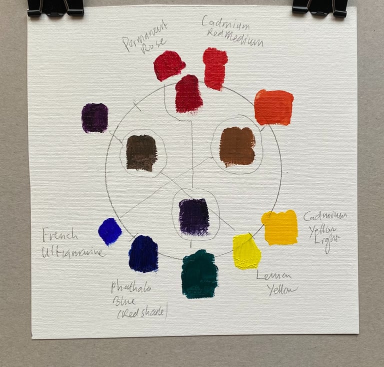
Using the colours from Carol Marine's "Daily Painting" and seeing seeing if I can replicate her colour wheel, and also what the values of the colours are.
OIL PAINTINGART
2/9/20262 min read
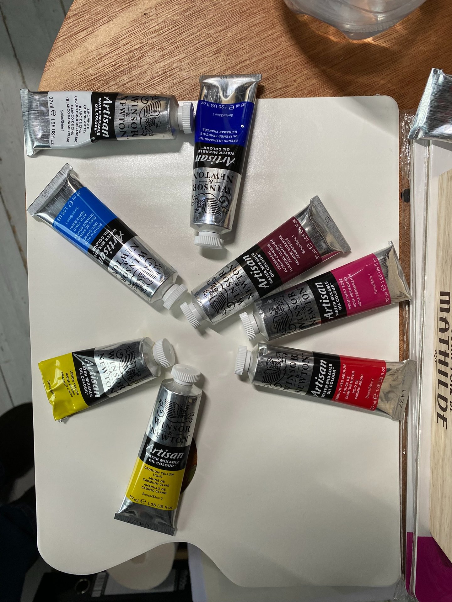
I am getting back into oil painting, so today I thought I would try playing with colours. Carol Marine has a good section in her book "Daily Painting" on how what we think of as pure colours actually have a small amount of another primary mixed in. So the pure colours 'lean' towards another primary. I laid them out in a wheel as per her book, and tried mixing the primary colours together, which was good practice at cleaning the brush properly after each bit! (BTW I am using water mixable oils - the Artisan series by Windsor and Newton. According to Carol, if you take one of these secondary colours and mix in a primary from the opposite side of the wheel, it should become destaurated and greyer. I am curious as to how colours map to 'values' so I want to convert the result to black and white and see which colours are darker and which lighter.
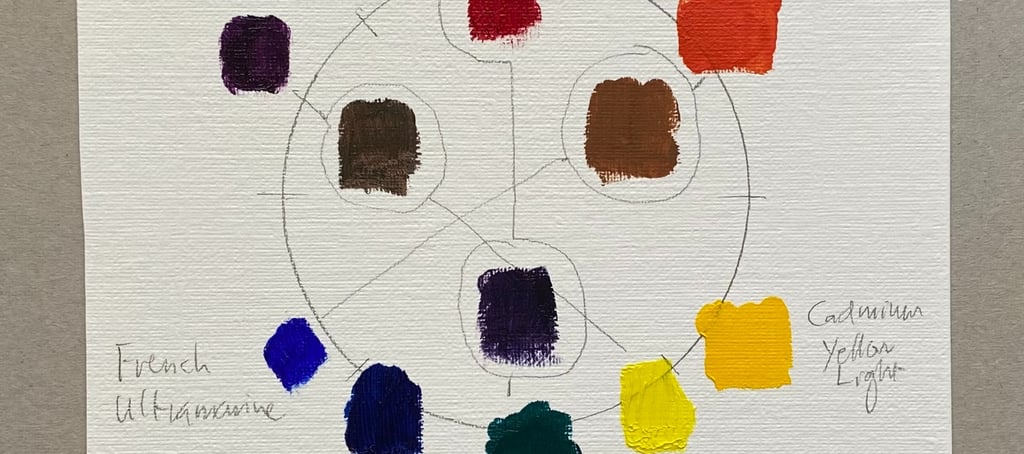
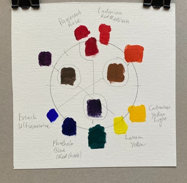
I laid the colours out as per her wheel. These were the colours I used (except white, which is in the picture but I did not use at all)...
And this was the result...
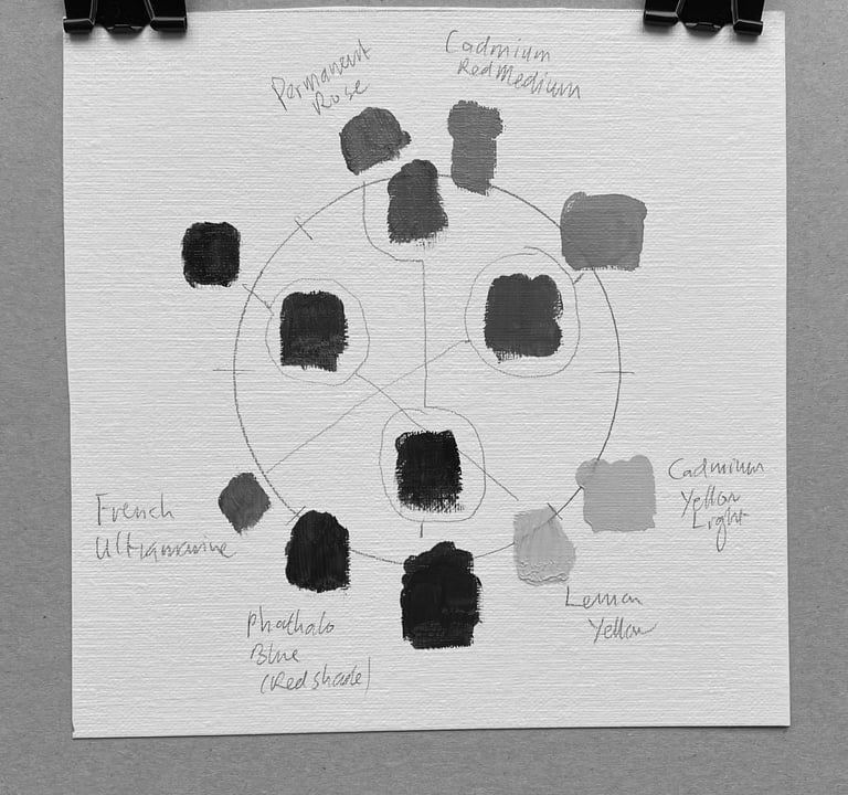
And converting to black and white (using the filter on the iPhone to desaturate, which is slightly different to converting to black and white in Paint.net)...
Some thoughts:
Adding the opposite primary colour did not seem to make it more grey - instead it seemed to go darker.
When converting to black and white, yellow is clearly a light value colour, red is middinglng, and blue is very dark valued.
Phalo blue is insanely intense! It took forever to clean the brush, and even now I am not sure I managed to get it all out. Note to self: use very sparingly!
Brand
Explore our sleek website template for seamless navigation.
Contact
Newsletter
info@austinrobertsartist.com
123-123-1234
© 2024. All rights reserved.
My post content